HENEN JEWELRY
Responsive web & mobile

ABOUT
HENEN is a local jewelry design boutique founded by designer Noa Hanen. The core of the brand is the production process that combines handicrafts and industrial production, in addition to a combination of organic and geometric shapes inspired by parallel design fields and nature.
The work on the project was motivated to preserve the brand's character and uniqueness, while maintaining a comfortable and productive purchasing experience.

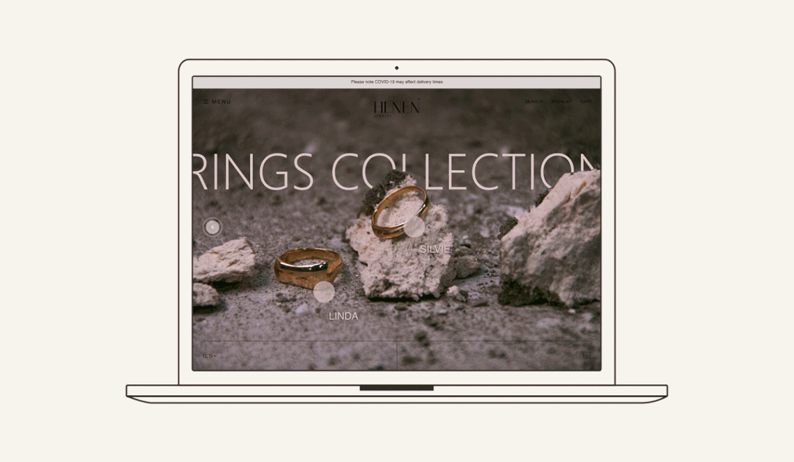
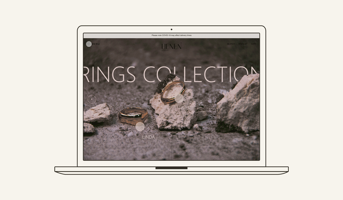
SITE MAP
As a result of extensive and in-depth market research of online stores, the usage scenario has been designed so that the navigation operations and the purchasing process are done in a convenient, fast and easy way.
Each stage of the route is carefully designed to serve this purpose. From the landing page, through the product pages and the lookbook, to the payment section, the user's click on any object on each screen leads to action.
On each screen there are also selected items, and the user can directly add products to the wish list and shopping cart.
The shopping cart itself functions as a side pop-up window to save time for loading a separate screen.
All of these functions are designed to allow the user to reach the purchase screen in just two steps from any screen.

DESIGN
The design of the site is based first and foremost the character of the brand: A relatively restrained and elegant language, while at the same time vibrant and unique. A dialogue between classic and modern, hot and cold, delicate and fragile versus bold presence.
The minimalist and clean approach of the design achived by san-serif fonts, the use of words instead of icons and the central color scheme. On the other hand the unconventional grids and slight use of warm colors adds character and flavor.
Created with Adobe softwares: XD, Photoshop, Illustrator.


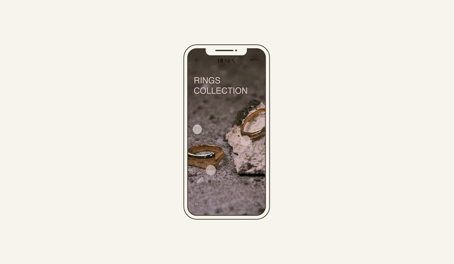
ADAPTETION TO MOBILE
The mobile platform preserves all the principles of the user experience and the design, and for this purpose necessary changes and adjustments were made such as: reducing information on one screen and transferring it to another (landing page and hamburger pop-up), resizing and hierarchies, turning side pop-ups into a full screen. The main highlight in the transition to mobile is the union between the product screen and the item screen. When click on an item, all the details about it and the action buttons (purchase, add to cart) appear below it.